
With the madness of the Galway Arts Festival and the Galway Races now over, my insomnia has given me time to work on new features for the next release of LRB Portfolio (version 2.2).
First up is that the annoying file opening when using Google analytics has been tamed. Thanks to Matthew Campagna for help with that.
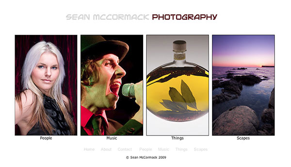
The main change though, and it’s a big enough feature for a dot release, is that you can now create a gallery index as the home page. As you can also have either Gallery 1 as the home page, or the original homepage, this needed quite a lot of trickery in the background. I’ve also allowed for 2 image widths so you can accommodate all 6 galleries in a reasonable width, or have a wider set for lower gallery numbers. The selection also takes care of the width to keep the index images centered. Yes, that was fun :).
Anyhow here’s a sample gallery to look at and get feedback from. LRB Portfolio 2.2. Dev Sample Website
Update: I’ve added a 2nd gallery version with a slightly different layout, different colours, and a normal scrolling gallery, rather than the CMotion one in the first version: LRB Portfolio 2.2. Dev Sample Website Version 2
Please let me know how this looks in your browser. What do you think of it? Please remember that if you haven’t used this plugin that all the colours are chanagle, as well as a host of other features including image size. These sample galleries are sized for people with low screen res and slower internet. Yours can be as wide or big as you like. What I’m asking for feedback on is the gallery index page idea. Is it worth adding?
Further feature-wise, I’m in the process of allowing you to set the text alignment for the Home, About, Contact and Blank pages. Also I’m adding the ability to edit the Contact Form titles (like ‘Name’, ‘Email Address’, etc).The base code is in place and working, but I need to add the text controls.
Also, LRB Portfolio has been on introductory offer forever, so with this release, I will be increasing the price to €15. Upgrades to existing users for all version 2 releases will be free of course, so those buying now can benefit from the lower price.


Hey Jason, thanks. What you're asking can't be done in LRB Portfolio currently. . There's a number of reasons for this, not least of all getting 2 different sets to fit on one line. There's no way to work out the offset height of the ID plate to put the menu in the correct place. Even if you could there would be no way to stop the ID plate running into the menu.
I got the LRB Portfolio a few weeks back and it's ease of use is fantastic. Great site "right out of the box" as they say. I haven't "gone live" with my LRB site, yet as I am still tweaking a few little things out.
One question, though … Is there a way though where I could move the navigation bar from the bottom of the slide strip to the top, maybe to the right of my logo? I cannot seem to find a setting where I am able to do this.
Overall a great buy!
Cant wait for the gallery index feature!!!!! I need that badly. Also, the ability to align text would be great.
Whatever.
If valid reasons for why the sample gallery are the way they are, are not to your taste, fine. Users can set them however they like.
Or maybe you think Zack is the be all and end all.. He's a great guy, good tutor, and there is some great advice in the critiques: the link which you've deleted is http://www.zarias.com/?cat=82
Personally I especially like where he advices people to tighten up the portfolio to show the work they want to do. Focus. Great stuff.
But he's not right about everything. Any more than Joe, or Chase, or Scott, or anyone for that matter. Me either.
The sample site is designed to look fine on 1024 screens. 6 images at 200px with the gaps will barely fit on a 1280 screen. Look better on 1440.
If the user wants that.
oh man.
you ask for feedback.
you get it.
i'm dropping you from my bloglines.
bad karma.
Can't do much about the scrolling as it's 3rd party script. Bob pointing out forum tips got some of the extra features in, but it's not exactly under my control.
Still a bit to do before 2.2 comes out. Including the dreaded User Guide update.
Hi Sean,
I've been a user for quite a while so my comments are really only with respect to the new "look" in 2.2.
I love the new "homescreen". It gives a far more professional look and a more logical way to link to galleries.
Something I've mentioned before is that the scrolling by javascript can mean it's not obvious to a visitor that the images can scroll. I find this is even more the case in 2.2 because once loaded the galleries now look almost exactly like the front page (which does not scroll). Obviously choosing to auto-scroll or display the scroll bar works around this issue but I thought it was worth mentioning again.
Something that is very much a personal preference is scroll speed which I realise is configurable. For what it's worth, I find your demonstration site to scroll way too slowly, it takes over a minute to get from one end of a gallery to the other.
In all it's a worthy upgrade and I can't wait 🙂
James
A macbook pro is 1440px wide. The current average screen size of someone looking at the net is 1024 pixels. A wise person does well to serve their viewers, not themselves, especially if they are seeking work through it.
I've seen Zack's critiques, as they came out in fact. While there are some useful things in there, it's far from the be all and end all. I would also disagree with some of the things said. After all, it's just someone's opinion. Being famous on the internet is not a prerequisite for being always right.
I suspect you haven't used this plugin, or you would know the size of the image is user settable.
This current size loads fast for those on slower access. Even in the US broadband penetration is 75%. Meaning there are still loads on slow internet. Also large images are better for stealing and using without permission.
Ultimately the choice is in the hands of the plugin user.
The text alignment will be just the 3 CSS options: Left, Justify, Right.
Thanks for getting back to me Sean
Obviously being a bloke I don't read the manual !! 🙂 You just get stuck in until you get stuck then look at the manual except it was late last night and i decided to go to bed then i saw your blog today and commented from work.
Coding and copyrighting are completely different ball games. Coding I've never tried looks bit daunting, copy writing i can do but it takes me awhile to hone it down to something succinct and understandable.I'll pass on the manual rewrite.
The key thing for me is text alignment/formatting. it would look better graphically ( which is important if your trying to sell to creative people ) if the ID plate copy or image lines up with the text. What I'm after is a left align or Justify for the body text. Once I know where that is all i need to do is play around with the ID plate text / image to get it to line up? I can live with the menu not lining up.
Hi Robbie,
Thanks for your time, as you've obviously put some in here! Paragraph per suggestion as answers here:
It's pretty hard to tell how people respond to the user guide. Often people miss things that are there, or feel there not explained enough. In this case I've just added your text into the gallery section.
I should explain that Lightroom inserts the decimal point, or rather Lua, which is a PITA. I actually have 20 in the code, not 20.00. The only way I can see around it is, for every number, create another variable and then round it, for about 30 numbers. It's a joke. Lua has no number types, so you can't specify that it's an integer. I've discussed this with Matt, and he came up with the same solution. Easy for 1 number, horrendous for 30 odd. BTW If you're volunteering to write a user guide, feel free 🙂 It's a bloody tedious job and takes longer than the coding on certain things. Coding and manual writing are for different brained people for sure.
What your asking for in terms of text left alignment can't happen. How long is the ID plate? What if it's right aligned and short, so it doesn't even reach past the image? There's no way to make the match happen. The best option will be to justify the text.
I've mentioned text formatting in the manual, on page 4. It's definitely in the help thread, in more than one place.
re: Flickr. There is a blank link that can be used for anything. As for the icons, they are are laid out the same as on pretty much every page I've seen them on. Right now, there is already way too much clutter in the menus because Lightroom doesn't provide a way of creating custom panels. Adding 2 more sliders for each icon to align is just absurd to me. On the drawing board, but doubtful.
The instructions on using images that are not in the galleries is already in the User Guide. 2nd last page. Essentially you just include more images than the gallery needs and reference their number.
Robbie, thanks for your time in doing this. cheers for the suggestions. Some have been taken on board already, and hopefully the stuff from the user guide you've missed will help too.
Hi Sean
I bought LRB Portfolio last week and was playing around with it last night properly for the first time. Nice plug in so far.
Only criticism would be you need to make it clearer how you load the different images in each gallery. it took me a few minutes of playing around to figure it out. the decimal point in the preloaded 20.00 confused me I though you had to put the start number and finish number of the images you wanted in that specific gallery. I think you need to say something like "if you have a total of 100 images for 4 galleries with a 35 in the first gallery, 25 in the 2nd and 20 in both the 3rd and 4th. then put these number 35, 25, 20, 20 in the respective Gallery numbers input box."
The text alignment feature would be an excellent addition. the left body text align should line up with say the Text ID plate left align and the Menu text left align. Graphically this would look much more professional.
Also a bit more information in the PDF Guide on how to format the text i.e. how to insert the paragraph break. you show it on the video but the resolution isn't high enough and i can't make out the html code/ tags. It might well somewhere on the blog I just haven't looked for it. if you designing this for Code shy photographers ( ie. me ) you need to include basics like this.
Gallery index for the home page is also a good idea – i was thinking of putting up a montage shot for the home page and this will save some work.
The only thing you don't have is a Flickr link on the contact page. People might like to RSS photographers Flickr feed, I know I do. From a graphic design point of view i would put a bit of space round the MySpace Facebook etc logo / links on the contact page
Is possible to have the large images on the about and contact us pages which are NOT in one of the Galleries? e.g dedicated "get in touch" type image of phone for the contact us page.
best wishes
Robbie