
For those abounding on Flickr and other similar sites, here’s a few looks that are currently popular and easy to create with Lightroom:
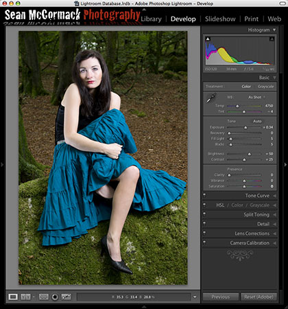
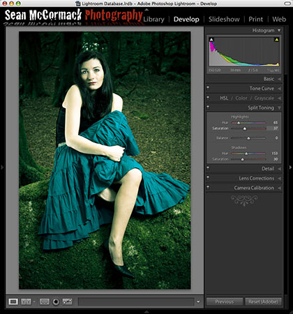
Let’s start with our base photo:
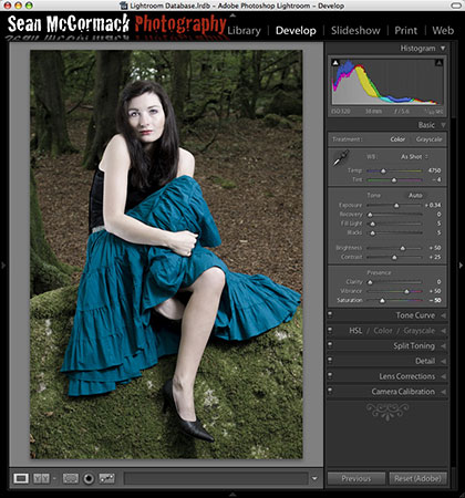
To get a muted look, start by adding Vibrance and removing Saturation. As Vibrance only saturates colours that are not already saturated (it also protects skin tones from becoming too saturated), we can effectively remove saturation in a controlled way by applying Vibrance and removing Saturation. I use +50 Vibrance and -50 Saturation as a starting point. Change it to taste from there.
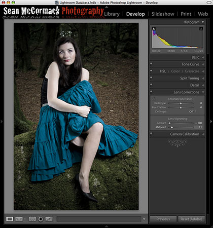
Next up we’ll add some creative Vignette. Now Vignetting with Lightroom is generally only a corrective tool, but with uncropped images, it works fine for creative control. Here I’ve applied -100 Vignette and moved the midpoint to taste (11 in this case).
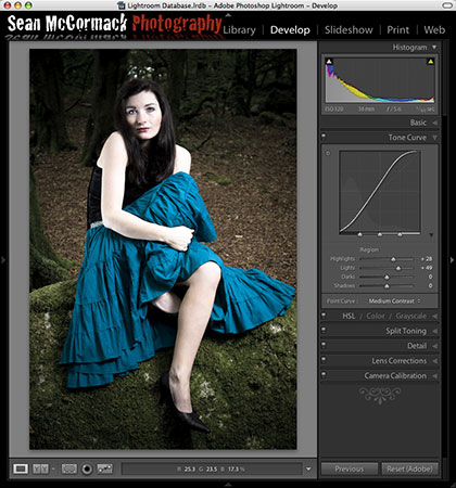
Because I’ve done such an extreme vignette, the skin has darkened too much. I want to retain the effect of the Vignette, so I use the Lights and Highlights in the Tone curve to taste for the image. Here I’ve used +28 Highlights and +49 Lights.
The image is finished for my taste, but if you like you could add a Cross Processed finish. This is done quickly and easily using the Split Tone Pane. The fastest way to use this is to by holding down the Option key (Alt on PC) and moving the Shadow and Highlight Hue Sliders to select the shadow and highlight tone colours. This set the Saturation level to 100 when you move the Shadow/Highlight Hue sliders, allowing a quick preview of the effect. With Cross Processing, the Shadows tend to be in the Blue-Green range, while the Highlights tend to be in the Yellow-Orange range. Once you’ve selected the colours, increase the Saturation sliders to taste. I find that lower values work better than higher values. For this deliberately green/yellow look, I’ve used Highlight Hue 65, Saturation 37, Shadow Hue 153, Saturation 30. You can also use the Balance slider to favour Shadows or Highlights.


Correct David, I left out a ‘not’ there.. John Beardsworth corrected me also. That’s what late night writing and proofing will do. Fixed.
The article states: “As Vibrance only saturates colours that are already saturated” – I thought the point of the Vibrance slider was that it only affected colours that were not yet saturated and therefore did not over saturate colours in the image.
Whatever – it’s a neat look!