I’ve well documented little workabouts for various different things using the ID Plate. Usually things it was not intended for, like Print borders or Copyright symbols.. Well here’s thing relating to the ID Plate that I’ve found this evening. Pardon me if it’s common knowledge, but hey, I’m like the kid who added the extra note to the pentatonic scale and created a new rock guitar scale.
I was shooting a CD cover for someone today, and after I send off the selected image with a bit of retouching, I got to thinking about ways of adding text to an image in Lightroom. Of course this made me think immediately of the Identity Plate. I typed in the name of the artist and a title. Yes! Well except they’re together on one line. It looks okay, but I’d like to have it with the name on the top and the title on the bottom. I’ll need 2 ID plates, so it’s not possible.
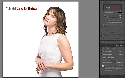
I click on the ID Plate editor and place my text cursor after the name and try a few modifier keys. Aha!

I find something that works. I used Option+Enter (Ctrl+Enter on PC-From Adler in the comments) and the title jumps to a new line. So I use the shortcut a few times until I have the gap I need. Finally I use the scale and hand tool to get the text where I want it. Now I’m not advocating a text tool for Lightroom, but it would be nice to have movable text in Print, not just at the bottom of the image!





With Windows 7 64 bit, you cannot get the second line with any key combos.
14 april 2010
Still working here.
Enter the full text, then go to the gap and use Option Enter there.
Doesn't seem to work with Lightroom 2.0 … LR simply exits edit mode still with a single line
I tried it on my Windows XP but got a “dot” in addition to the carriage return. I wonder if it’s font-related. I’ll try it with a different font later.
I use Lightroom in windows XP, the key is CTRL-Enter instead of Alt-Enter